The Designer's Guide to the Box Model
Learn this front-end concept to improve your designs and collaboration with developers.
Have you ever wondered whether you should learn how to code?
I often get this question, and my answer is NO.
I graduated in Computer Science and started my career as an engineer, but my answer is still NO.
I mean, if you want to learn, go for it. But most designers I’ve met aren’t interested in coding.
And that’s okay. I hear you.
You don’t have to learn how to code, but you should understand some fundamental front-end development concepts.
Welcome to the first issue of a limited series from Nucleus, where I will discuss front-end development concepts useful for designers. My goal is to help you become the designer your developers love, create something beautiful yet practical, and streamline your projects.
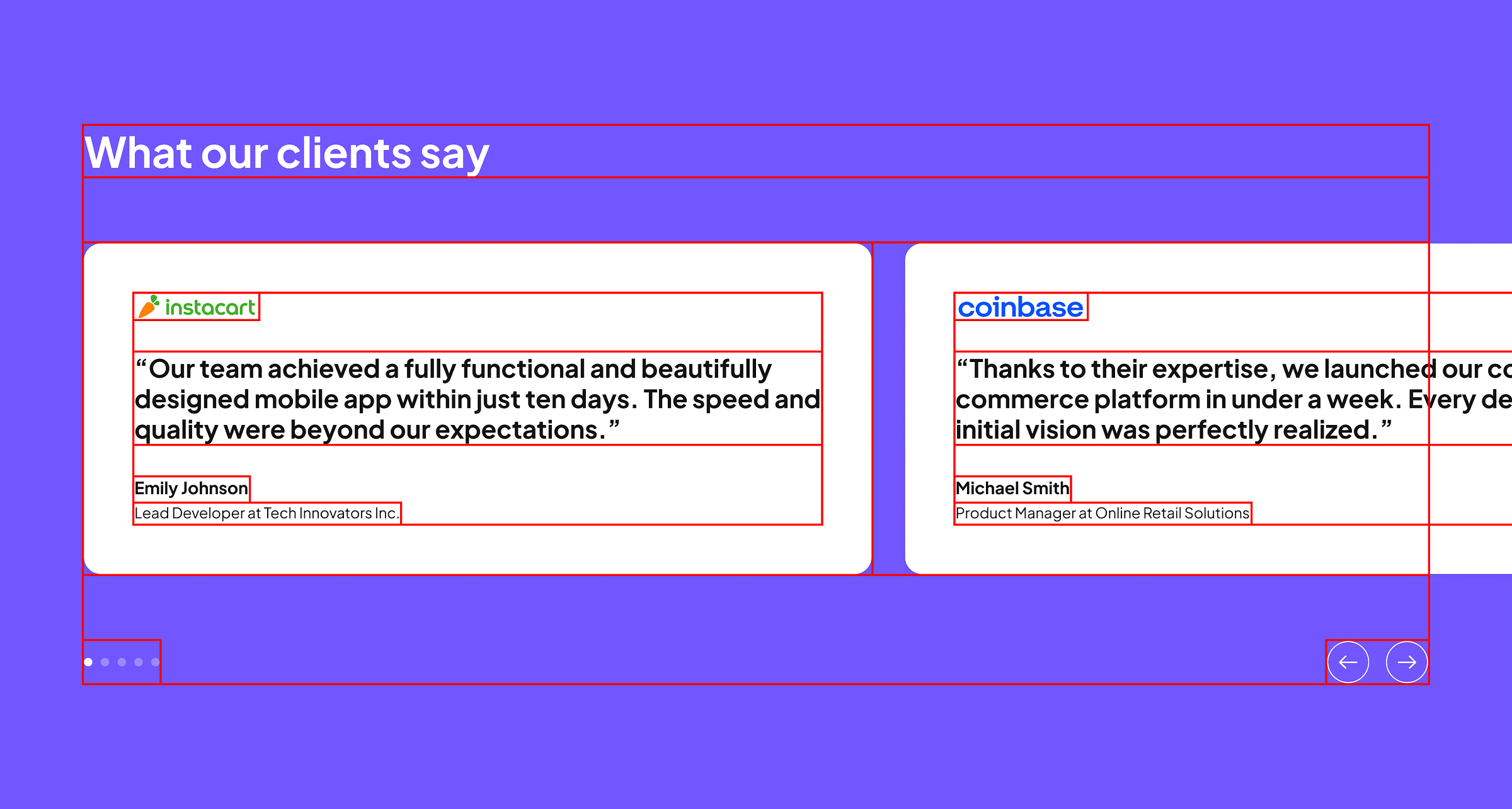
When you present your design to developers, instead of enjoying your masterpiece, they will likely switch to analytical mode—assessing your layout and viewing your design in terms of boxes.
Box model concept
Viewing a UI layout in boxes is a fundamental concept in front-end development, where each element of a web layout is treated as a box, often referred to as the ‘box model.’
I know, ‘box model’ sounds boring.
You don’t want to be constrained by boxes to create an exceptional layout. Designing a beautiful layout alone is hard—designing a beautiful layout with the box model in mind makes it even harder. In an ideal world, you would adopt the box model concept and still strive to balance beauty with practicality.
Let’s take a closer look at the box model.
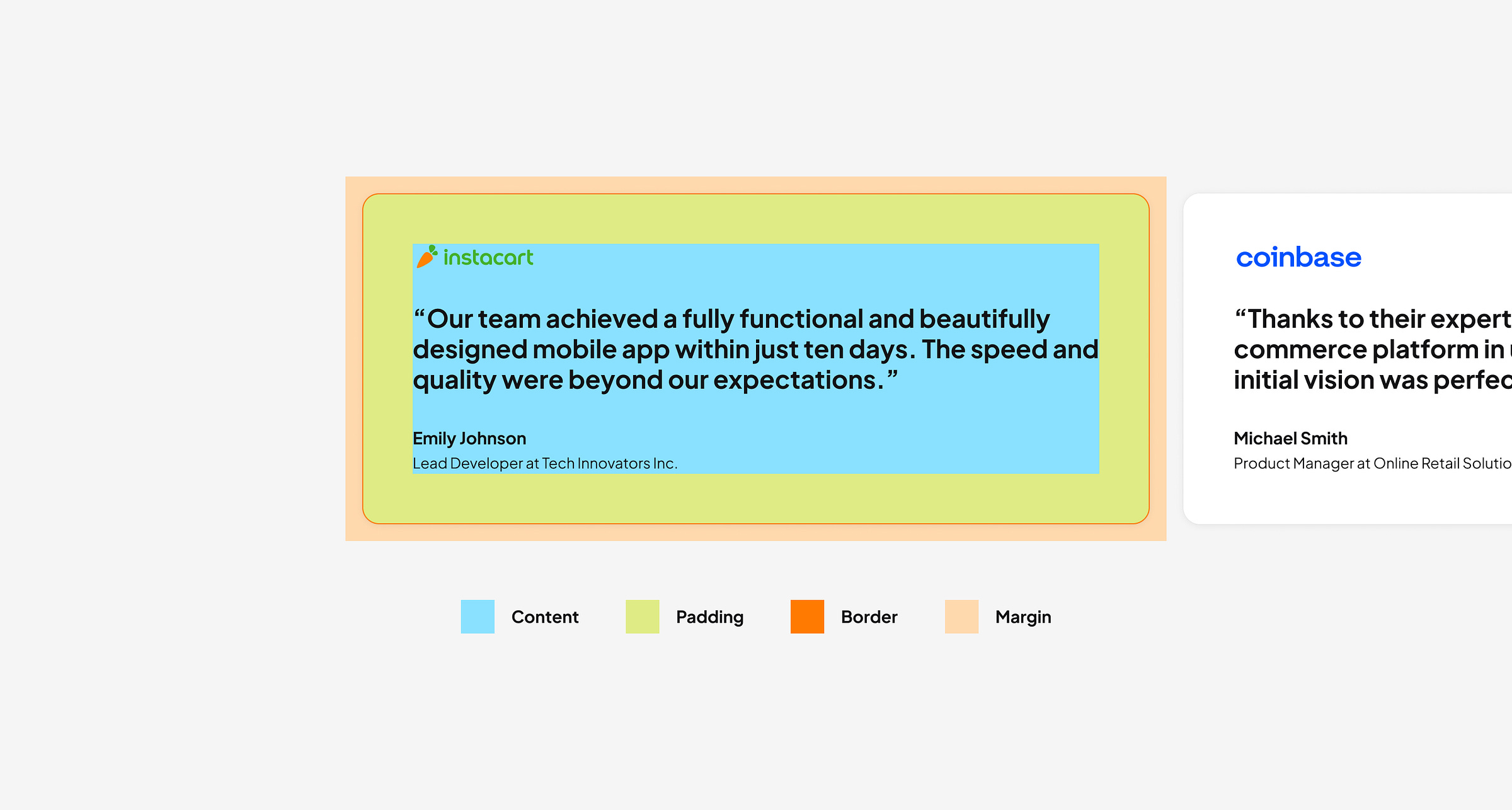
A box model treats on-screen elements as boxes with margins, borders, padding, and a content area.
Content is where text, images, or other media are displayed.
Padding is the space between the content and the border.
Border encloses the padding and content. It can be styled in terms of size, color, and style.
Margin is the space outside the border that separates the box from other boxes.
In your web browser, try inspecting elements to see how elements on a website are treated as boxes.
Auto layout on Figma works like the box model
Auto layout automatically arranges any elements you select into a horizontal or vertical line, converting them into a box. You can then add padding around this box.
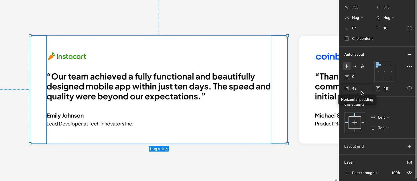
However, to adopt the box model, you don’t necessarily have to use auto layout. You can also use frames while still designing with the box model in mind.
My design workflow with the box model concept in mind – using frames
My workflow starts with designing freely, not worrying about the box model at first. If you’re used to the box model, it will naturally fit into your process. But this can be annoying sometimes because thinking technically might feel limiting.
If you don’t like using auto layout, once most of the layout is complete, I check each element to make sure it aligns with the box model concept. I do this by organizing the elements using frames, which function like boxes, instead of using ‘Group.’ Frames are similar to boxes, where you can assign padding and borders. To add padding, I hold the Command (Cmd) ⌘ key and pull out the edges of the frame, something you can’t do with a ‘Group.’
Check out how Nucleus UI uses frames with the box model in mind.
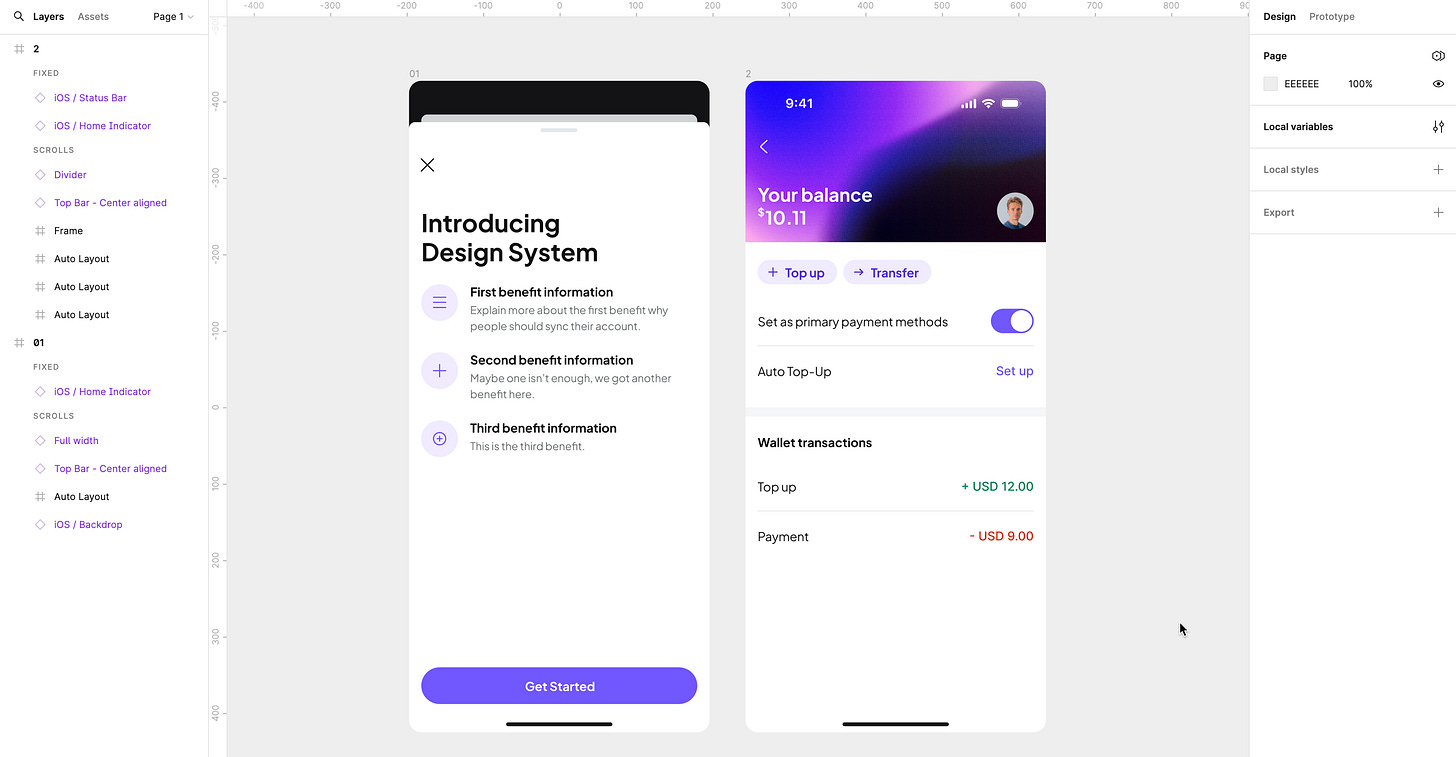
I hope this guide is useful for you to understand how developers would view your design. Let me know what you think in the comments, and please share if you have any useful tips for embracing the box model in the design process.
Stay tuned for the next guide.


