


Style Board: Defining the direction for designing UI screens for the first time
Style Board: Defining the direction for designing UI screens for the first time
"Your direction is more important than your speed.” ~Richard L. Evans

Starting a project from scratch can be daunting. You might not know where to begin, and there's always the temptation to rush into things.
Before designing every single page or screen, it's essential to understand how the style will be applied. This will give you more confidence in designing various patterns and cases for each screen. Moreover, it minimizes guesswork for your stakeholders.
If your brand is well-defined, I assume it has a set of moods that describe it.
If you haven't done so already, it would be beneficial to establish a mood that could represent the brand. This is where a mood board will come in handy.
(We’ll discuss the mood and the board at another time.)
Okay, let's get started. Imagine you already have the brand set up.
Now it's time to explore how the overall UI screens will look with a style board. Essentially, a style board is like a mood board, but more developed. Instead of looking for ideas from different sources that could represent the mood, here, you translate that mood into UI elements, bringing you one step closer to the final look of the app.
Here’s what the style board will look like.
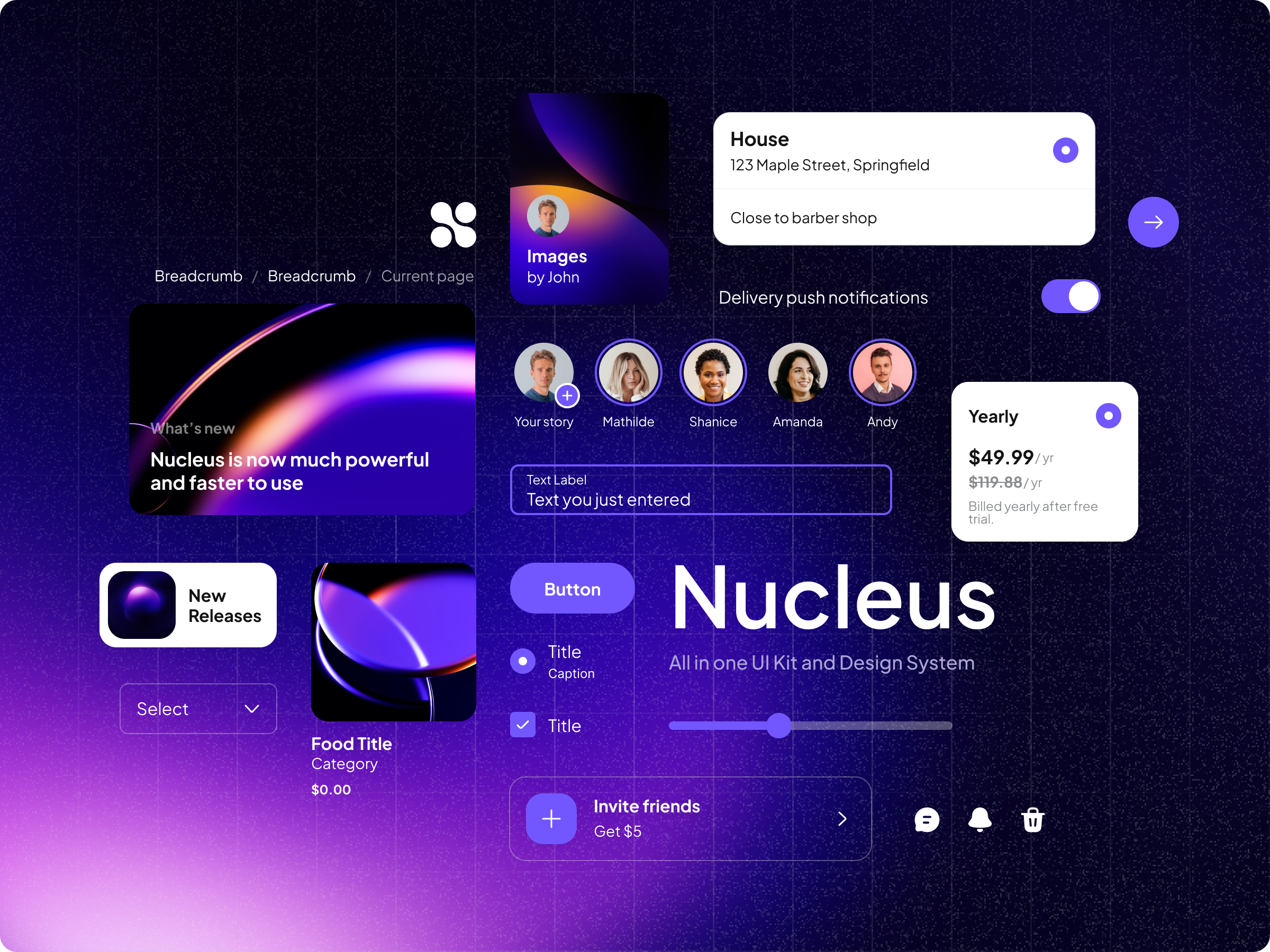
The style board will reflect the overall style of your app.
You will receive feedback, iterate on the style, and finally receive a sign-off before applying the style to each screen.
While there are no standard rules for creating a style board, here are five tips you can take.
1. Ideally, you would have wireframes or a general understanding of the components/patterns you will use
To start a style board, I typically examine the wireframes to identify potential components for the project. I aim to create components that will be utilized, allowing me to include the majority of them in the style board. This approach enables me to progress through the project more efficiently.
If wireframes are not available, I examine the user journey or scope to identify potential components. At the very least, I focus on the most commonly used components, such as buttons, text fields, and form controls like checkboxes, radio buttons, and switches.
2. Use a component library to utilize some basic components
Some components, such as buttons, checkboxes, radio buttons, switches, and others, are consistently similar across projects. Save time by utilizing a component library like Nucleus UI, and adjusting the style to match the mood you want to achieve. Nucleus UI has a free and comprehensive version, covering all the basic UI elements.

If you want a more comprehensive UI Kit and Design System starter, consider Nucleus UI Plus.
3. Try making some patterns
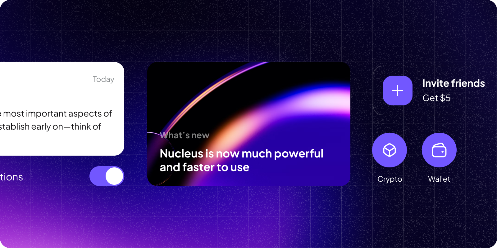
Brad Frost, the author of Atomic Design, refers to it as an organism when a component is combined with other components. This approach will help your style board visualize what the style will look like.
If you create these patterns based on wireframes, you are simultaneously developing elements and patterns necessary for use in the actual screens as you navigate the style.
4. Organize it beautifully
Remember, your goal is to convey your vision for how the UI of the product should look, so present it as beautifully as possible.
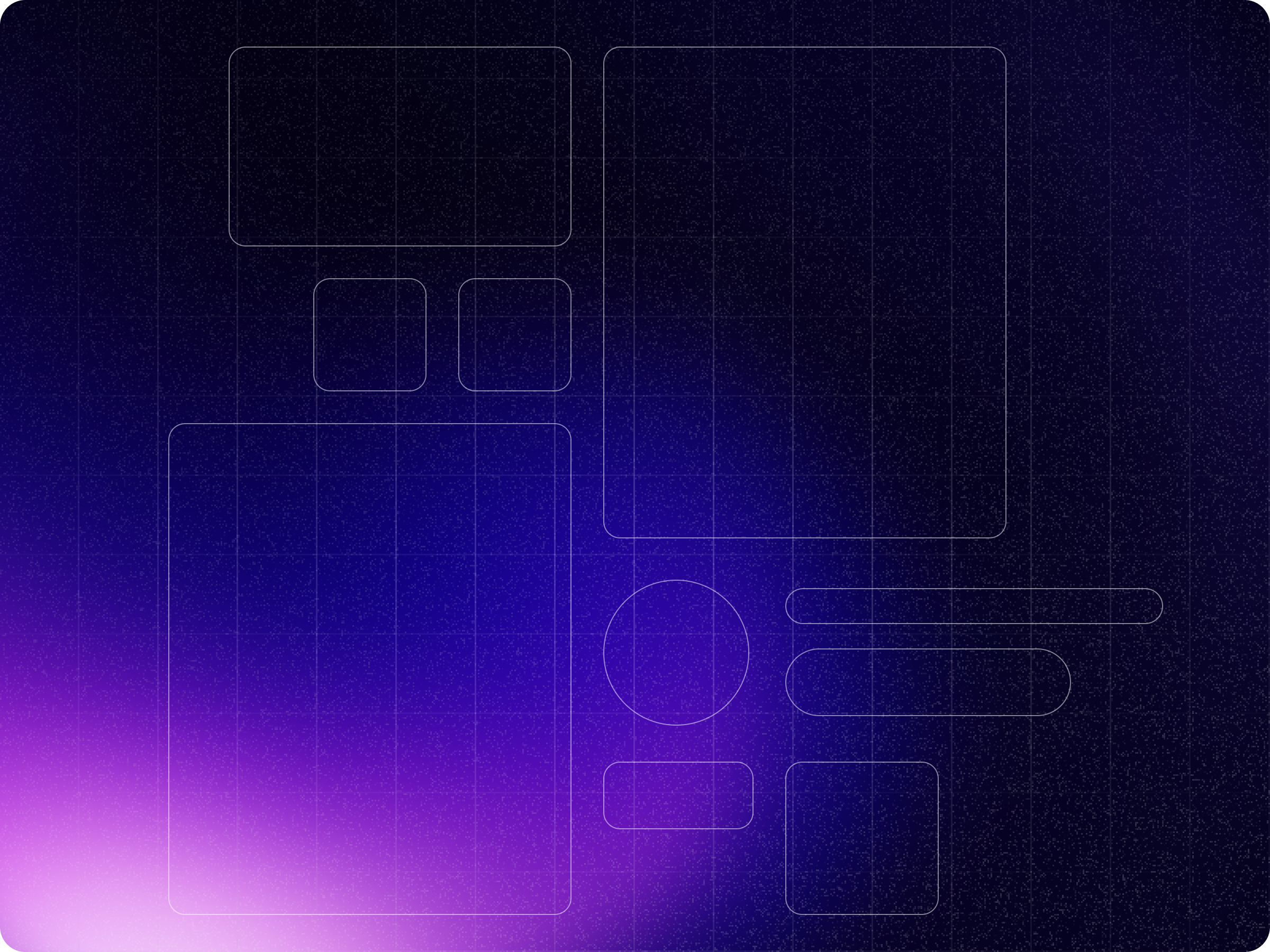
The layout is essential, so spend some time finding the right one for your style board.
Use only the unique components or patterns to make it look more dynamic. Be selective.
Make sure they fit into your deck format for presentation—use a 16:9 ratio.
5. Make alternatives
While I strongly recommend developing only one style board and iterating on it, occasionally presenting different interpretations of your brand's mood to your stakeholders can be helpful. This approach makes it easier to discuss, compare, and feel confident in making decisions as you and your stakeholders explore various options.
A style board is an excellent way to advance your project before designing every screen. It offers a dual advantage: defining the style direction and creating the elements simultaneously. However, remaining flexible as you progress further into designing each screen is crucial, because you may encounter unexpected issues. At this point, it would be advantageous to identify the principles, the narrative, and the overarching approach to how visuals should be presented in your product.
Please let me know if you have any additional tips on defining the direction for designing UI screens for the first time.