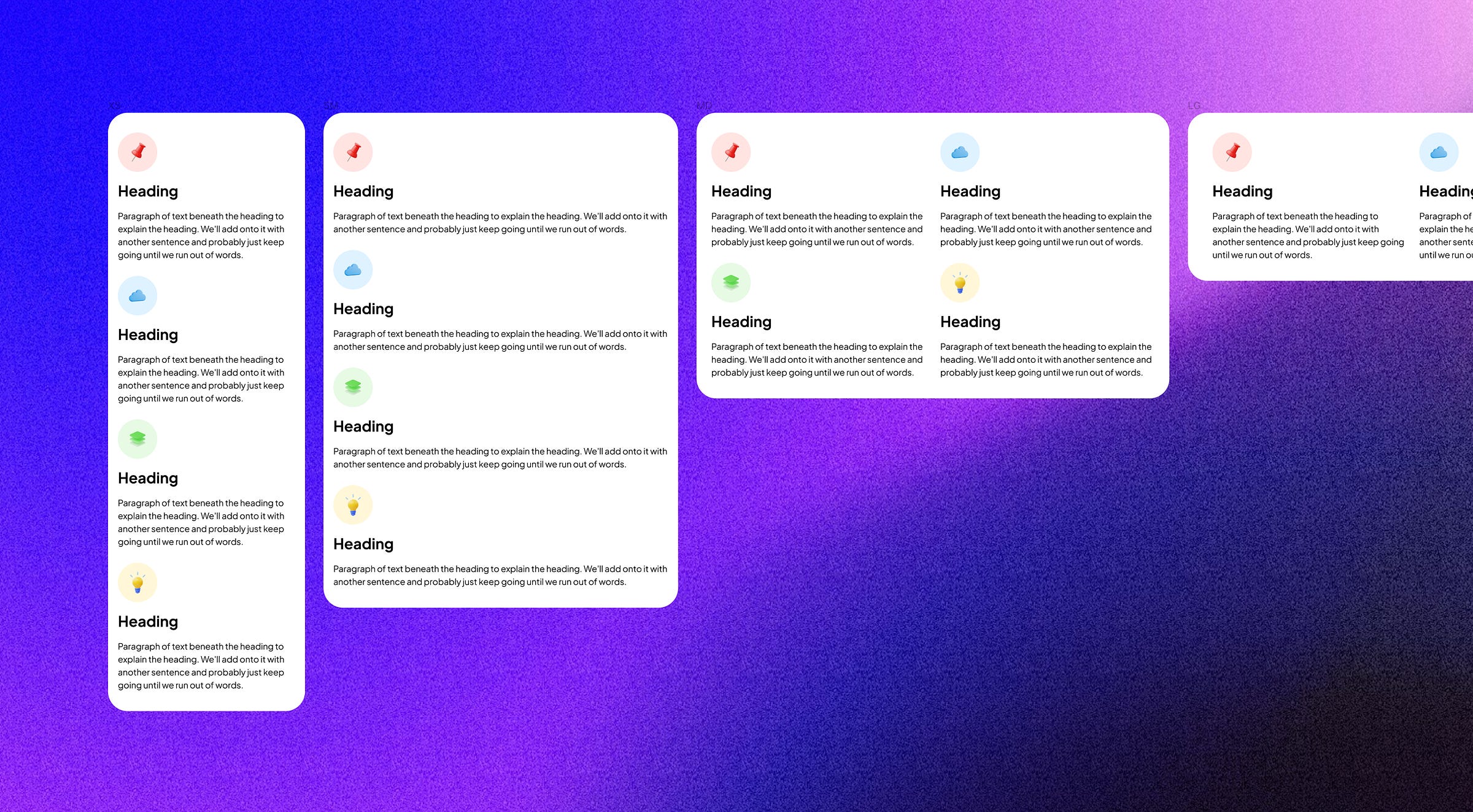
A step-by-step guide to creating a fluid responsive layout in Figma: includes video and file
Features Figma’s Update 2023: wrap, min and max width, and variables
Highlights:
Figma's 2023 new updates rollout includes min/max width and auto layout wrap, enhancing the creation of responsive designs to better align with developer expectations.
A step-by-step breakdown to achieve a rudimentary responsive design in Figma, from setting up frames to implementing variables.
With a pro subscription, you can utilize up to four variables, making sure consistency and effortless breakpoint toggling.
Features used:
Min and max width
Auto layout: Wrap
Variables (up to 4 modes – only in Pro Plan)
With the introduction of features like min/max width and auto layout wrap, Figma has taken significant strides toward allowing designers to create responsive designs that mirror developer expectations.
The ideal process for designing a responsive layout involves seeing how the layout changes across different breakpoints. Ideally, as seamless as adjusting a browser window.
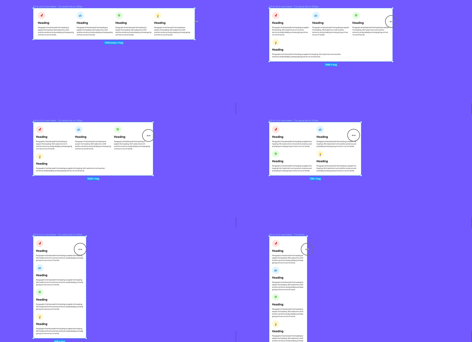
However, as of now, even with the new features, Figma hasn't reached this level of fluidity. When you resize the main frame (from desktop to mobile view), you might still encounter shortcomings, such as clunky columns like the one below.
Even though there's a workaround, it isn't something easy to grab. It's okay, Figma. I still love you.
I still doubt designers would prefer making responsive layouts by utilizing auto layout and setting min and max-width, even with variables; it can take quite some time to fiddle with. I personally find that making separate frames for different breakpoints and writing hand-off documentation is quicker. However, if you're still keen on this approach, I'll break it down step-by-step for you.
Hello there! It’s Thomas, the creator of Nucleus UI. I write bi-weekly newsletter posts about UI design, design systems, Figma, and beyond. Subscribe to receive them in your inbox.
Video: A step-by-step guide to creating a fluid responsive layout in Figma.
Set up the main container frame. Turn on the auto layout and pick the wrap option.
Set the width between 320px (minimum) and 1440px (maximum), using Bootstrap as a reference.
Create frames that look the same. We'll use these as columns. It's simpler to create them outside the main frame.
Convert these column frames to the auto layout.
Make sure the content inside it has 'Fill container' for the horizontal resizing.
Set the minimum width for all the column frames to 288px. I made it 288px because, on the mobile view, there's a 16px margin on both the left and right sides.
Put these column frames inside the main frame. For their width, choose the 'Fill container' option.
And there you have it–a basic fluid responsive layout in Figma.
Taking it up a notch with variables: setting up breakpoints as modes
Variables allow you to:
Maintain consistency by storing min/max values, making sure of consistency across different pages.
Seamlessly toggle between breakpoints.
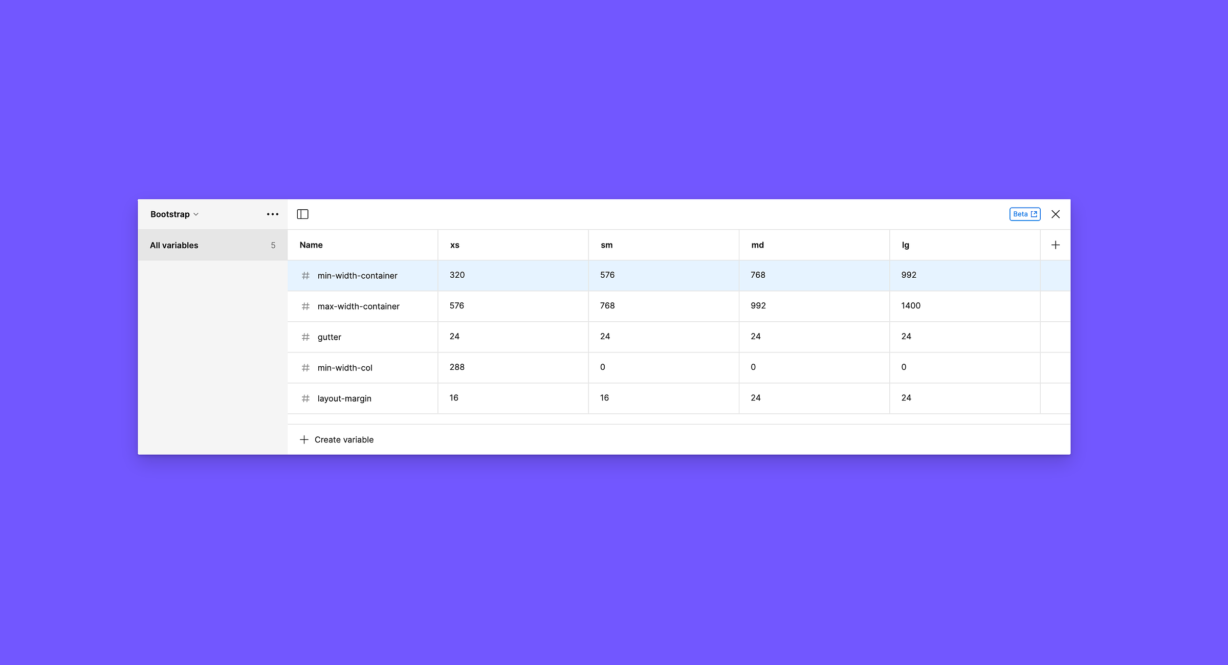
Here is the basic setup required for the variables below:
Remember: You'd need a pro subscription to handle up to four variables.
I’m taking a reference from Bootstrap for the breakpoints; feel free to change the values.
min-width-container: the minimum width of the main container of a breakpoint
max-width-container: the maximum width of the main container of a breakpoint
gutter: space between columns
min-width-col: the minimum width for a column
layout-margin: the margin on both the left and right sides
Now, assign those variables to your frames
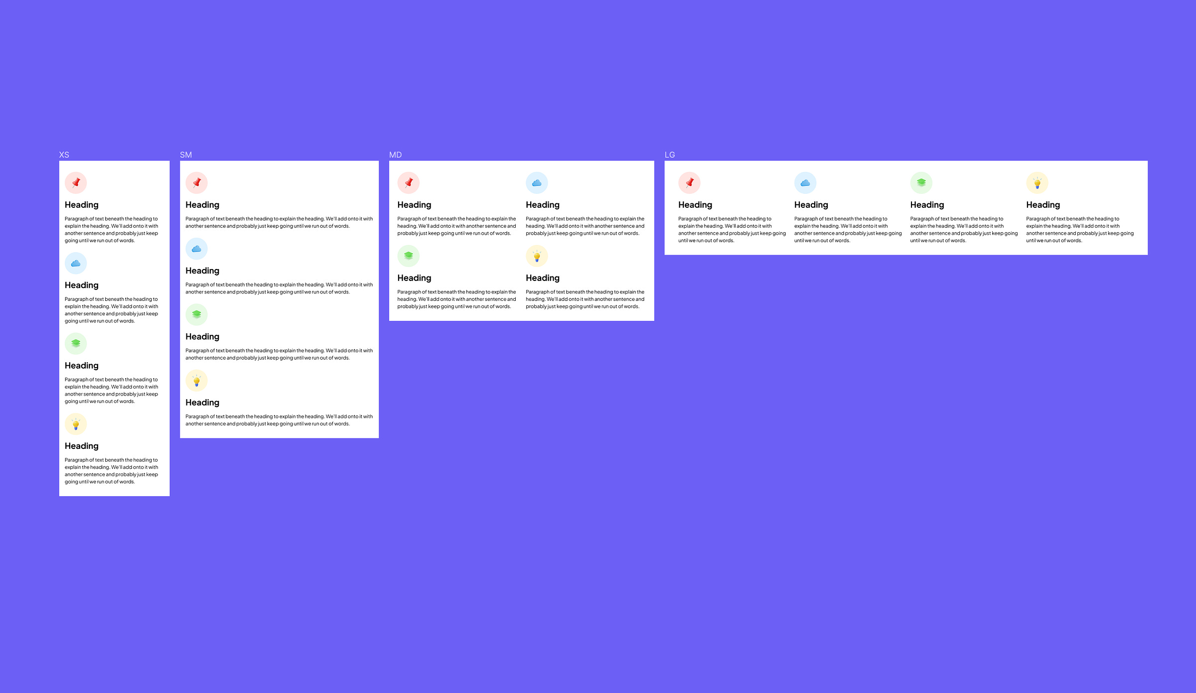
At the end, you will have 4 different frames like this.
That's a wrap!
For those keen on diving deeper, you can access the Figma files. See Figma file
Final notes:
In the development, in different breakpoints we can assign different column division, so you can have 4 columns in large (Lg) breakpoint, and 3 columns in medium (Md) breakpoint. We can still do it in Figma, with manual set ups – which is cumbersome. Well, is making a fluid responsive layout in Figma getting easier now with those features? Not really! But we’re getting there.
Nucleus likely won't have a responsive layout with this method because it requires a steep learning curve–a complex setup; not many people will benefit from it.
If you like my post, please consider giving it a ❤️ , subscribe, and share it with your design friends. Thank you!
Nucleus Plus is the all-in-one UI and design system starter kit for Figma
My mission is simple: I want to create a design system starter kit that truly helps you supercharge your design workflow, kick-start your projects faster, and level up your aesthetic.
Enjoy unlimited projects both personal and commercial and lifetime updates.
Support Nucleus
All the content on Nucleus and in the newsletter is accessible to everyone for free
If you like my post, please consider giving it a ❤️ and share it with your design friends.
Subscribe to the newsletter, if you haven’t.
Explore my other publication where I share practical tactics, frameworks, and mindsets that help designers remain intentional, self-aware, and thrive in their craft.
If you have any comments or feedback, or if you'd like to get in touch, feel free to send me a message. Thank you for subscribing!


Check out the Figma file here: https://www.figma.com/file/VciZItlSpWwxgZr7qW4gj8/Responsive?type=design&node-id=17%3A138&mode=design&t=0DqRnP6I12YDwyor-1