


Creating color systems and modes using Figma Variables in 5 steps.
Creating color systems and modes using Figma Variables in 5 steps.
A quick guide to starting robust color systems and modes. Figma file is included.

Hello there! This is Thomas, the creator of Nucleus. If you're reading this post, it means you've downloaded Nucleus Lite or purchased Nucleus Plus. Thank you for your interest and support for my work.
I'd like to share with you how Nucleus, the design system starter kit that I created, utilizes variables in Figma for the color system and modes.
If you're unfamiliar with variables, they're a new feature in Figma introduced in Config 2023. They allow you to store reusable values and assign names to them, similar to a style library, but they can be widely used. These variables can be applied to various properties such as width, height, border radius, and complex prototyping. You can create different modes like light and dark modes. If your project includes different themes, this feature will be perfect for you. Keep in mind that you can only create more than one mode by upgrading to a paid plan.
Without further ado, here’s a quick guide for creating a color system for different modes using variables.
Step 1: Start by defining global color variables using a set of colors for your product.
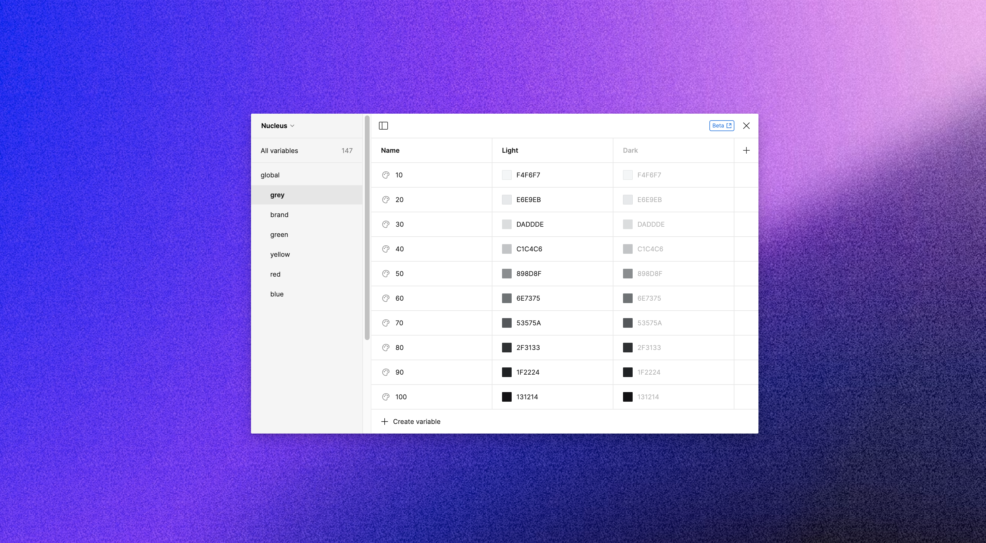
Global colors are:
Primitive values
At the root level of the design tokens hierarchy
Context-agnostic names
You won’t be using those global colors right away in your design. It’s difficult to use colors like grey-10 or grey-40 as references in your design process and, moreover in development.
Step 2: So we need to make aliases for those global colors to make them more semantic
It's always best to enhance clarity and readability in the way you use colors, even when working alone. It takes effort to evaluate and confirm the colors you're using and decide which color you should use. This is where aliases come in – they help make your process more efficient.
If you're thinking that the system might somewhat limit new creativity, I'm not discussing that topic here. It will be addressed at another time, in another newsletter of mine.
So, semantic color variables are:
Established based on their usage context. They have meaning.
Each semantic color corresponds to a color selected from the global colors palette.
The name of the semantic variable indicates where and in what situations the variable should be applied.
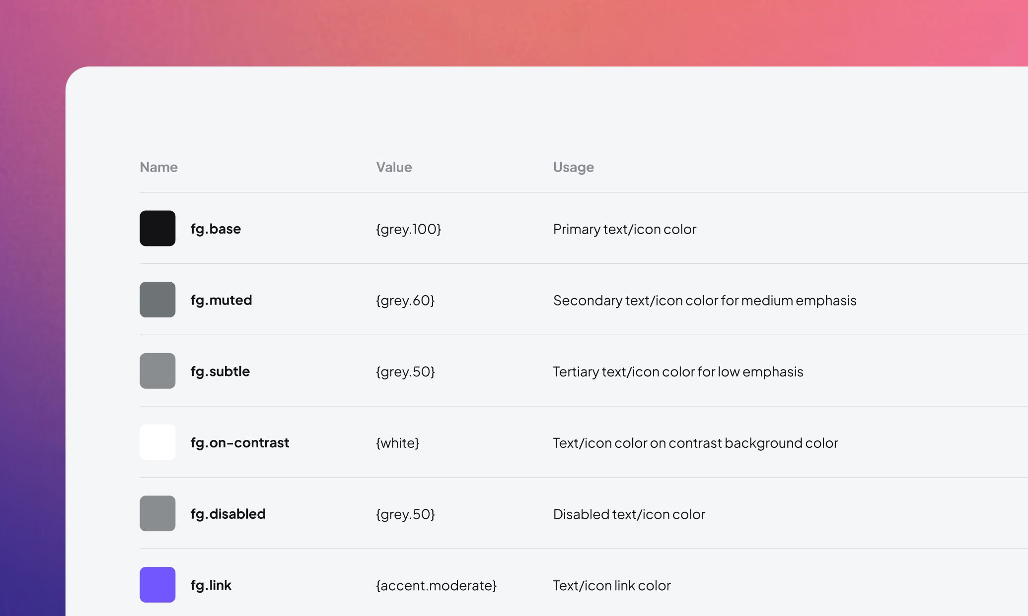
Let's take a look at an example from the semantic variables that Nucleus has: 'Foreground'. Foregrounds are semantic variables with a specific purpose for text, icons, or any objects positioned on top of a background.
The foreground is a category; you need to define the different situations in which you would use these foreground colors.
In my case, I use:
Base (Primary text/icon color)
Muted (Secondary text/icon color for medium emphasis)
Subtle (Tertiary text/icon color for low emphasis)
On-Contrast (Text/icon color on contrast background color)
etc
You don’t have to follow exactly what I have here with 'Foregrounds'. If you find it necessary in your case, you can separate foregrounds into 'Text' and 'Icon' to be more specific.
You can also create an additional layer for component-specific color variables that refer to the semantic colors you have defined. These variables are scoped only within the component they are associated with.

Value → Global Variable → Semantic Variable → Component-specific Variable
The deeper the layers go, the more rigid they tend to be, often only serving specific cases.
My aim with Nucleus is to offer a flexible starter kit, rather than a rigid, very opinionated design system and UI kit. Our approach allows a wide range of products and teams to benefit from Nucleus.
Step 3: Next is the fun part, the dark mode
In Nucleus, I designed both the light and dark modes using essentially the same palette, but in a reversed manner when it comes to applying the colors. However, please note that this arrangement isn't always a strict rule, so there's no need to worry about not adhering to it.

In my case, when I created the color system, I was a complete geek, tinkering with how the different modes could form a coherent system rather than an arbitrary arrangement. The interesting part was finding a balance between the technical aspects and keeping an attractive visual appeal.
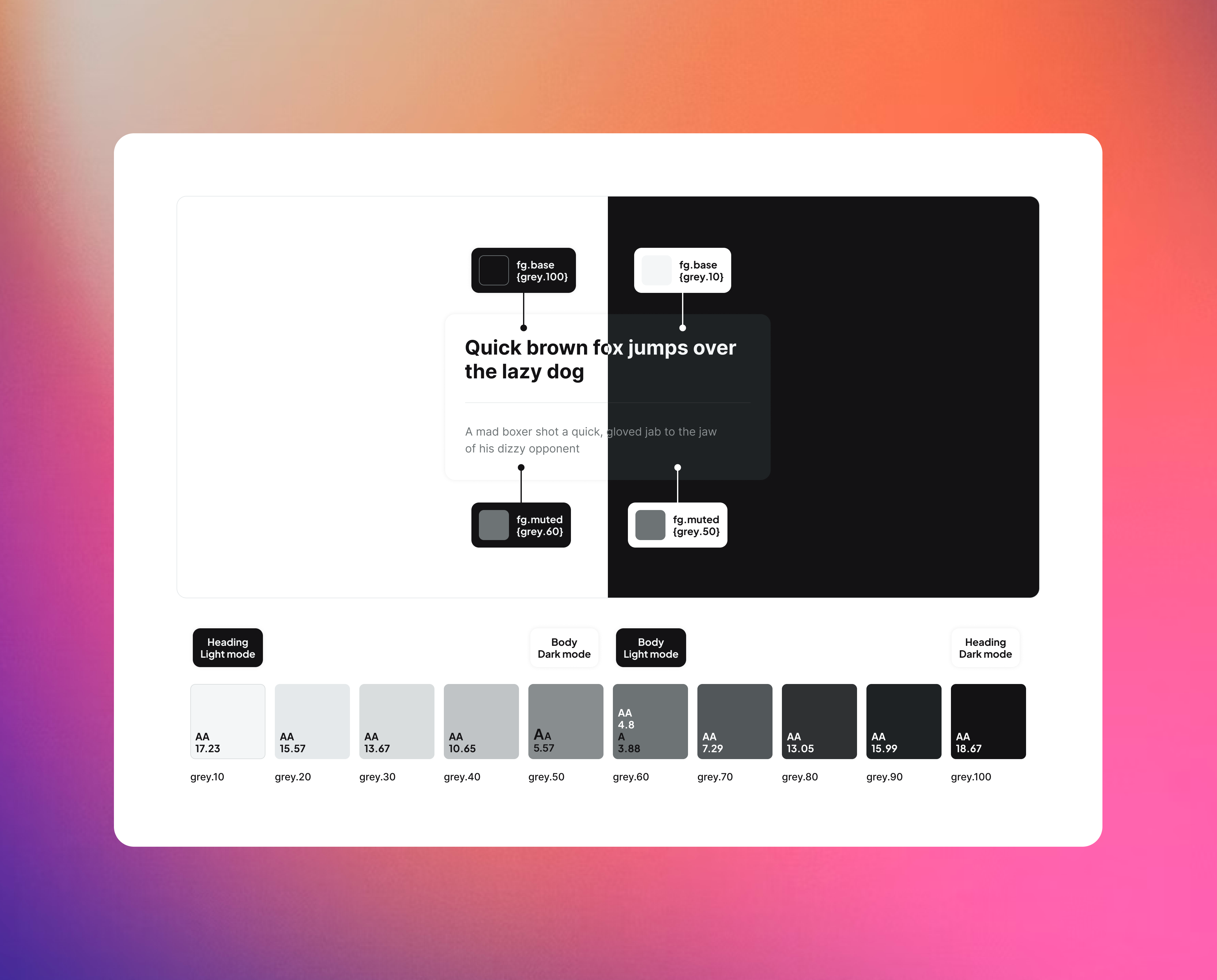
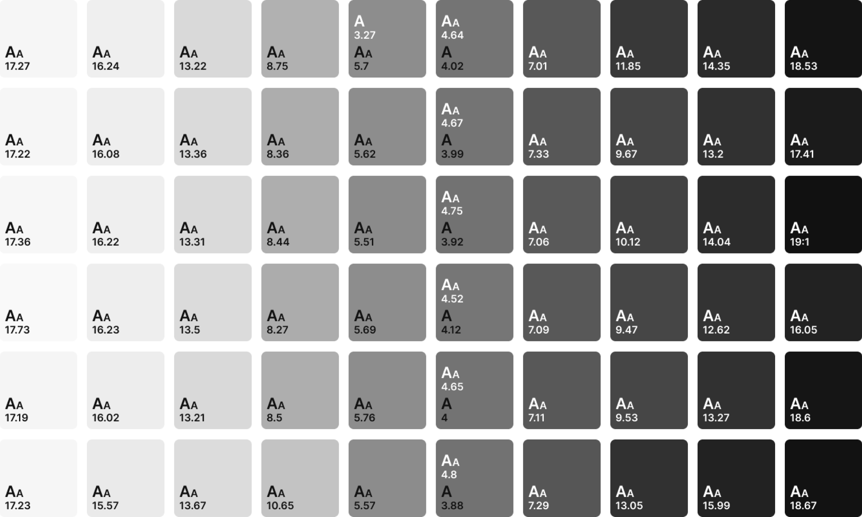
Step 4: Don't forget to check the contrast
It's always useful to understand how the contrast works for each color in your color range. Make notes on your palettes so that it's easier for you to reference them when needed.
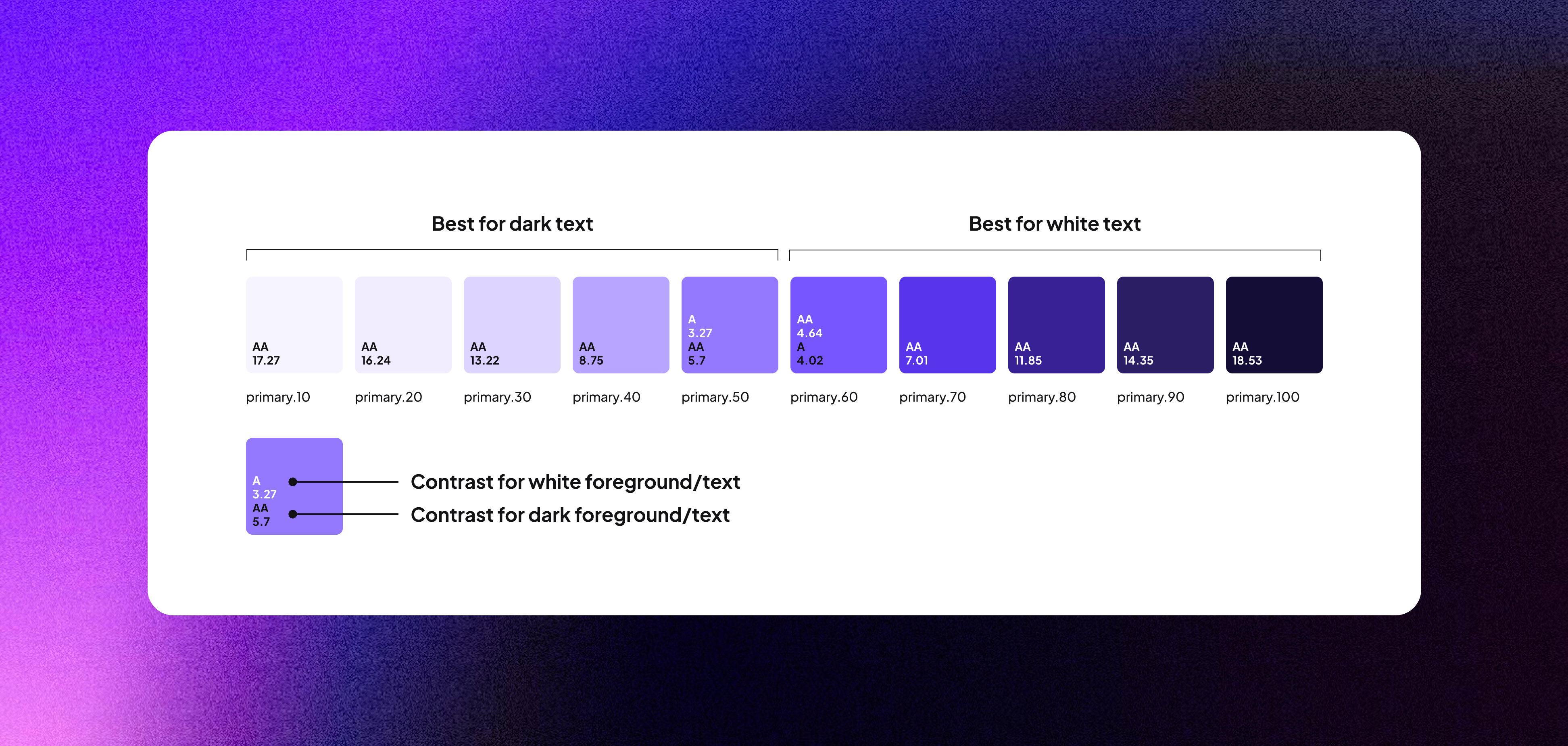
Large “A” means large text, typically 18.66px and bold or larger, or 18 points (typically 24px) or larger.
Small “A” means small text, typically 16px.
Make sure consistency in every color range across different swatches is essential to comply with the WCAG-compliant AA accessibility rating.

To check the contrast, please convert the color palette to grayscale. This will allow you to assess the contrast levels more effectively.
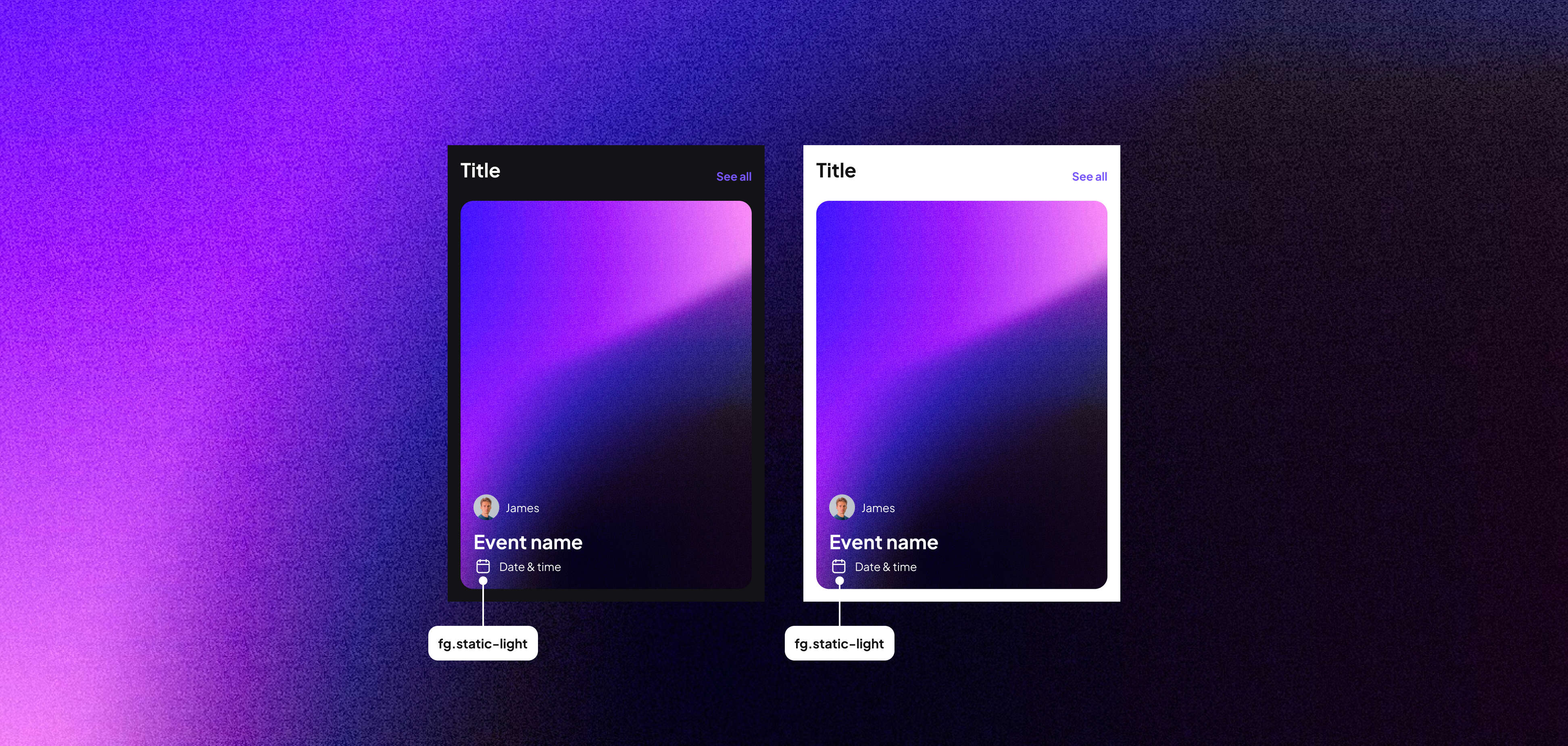
Step 5: Examine if any colors have specific rules
For instance, text on top of an image might remain consistent regardless of mode changes. You can label this as "static-light" or "static-dark" and maintain the same value across different modes.
Figma file
That's it! Thank you for reading my first post for Nucleus UI. I still have a lot of thoughts in my head, and those will be shared another time. I'll delve deeper into specific sub-topics about colors in the next post. Make sure to subscribe to the Nucleus UI newsletter if you haven't already.
Here I have prepared a Figma file for a little demo.
I'd recommend reading these resources if you'd like to learn more about colors in a design system.
Nucleus Plus is the all-in-one UI and design system starter kit for Figma

My mission is simple: I want to create a design system starter kit that truly helps you supercharge your design workflow, kick-start your projects faster, and elevate your process.
Enjoy unlimited projects both personal and commercial and lifetime updates.
Download Nucleus Lite – Free version
Support Nucleus
All the content on Nucleus and in the newsletter is accessible to everyone for free
If you like my post, please consider giving it a ❤️
Share it with your design friends.
Subscribe to the newsletter, if you haven’t.
If you have any comments or feedback, or if you'd like to get in touch, feel free to send me a message. Thank you for subscribing!